

Azuro's real challenge wasn't a single website — it was designing one coherent system across many products and user roles, each with different tasks but a shared look and feel.
Most visitors landed on the site only after a first sales call, so it had to expand on that conversation rather than start it. I researched homeowner personas and set design principles for a minimal, easy-to-follow experience. The key move was structure: I divided the site into three clear sections — for owners, for tenants, and about Azuro — with subtitles and visual references that made a dense range of services easy to scan. Facebook and Instagram drove traffic in, and the site converted visitors into leads.


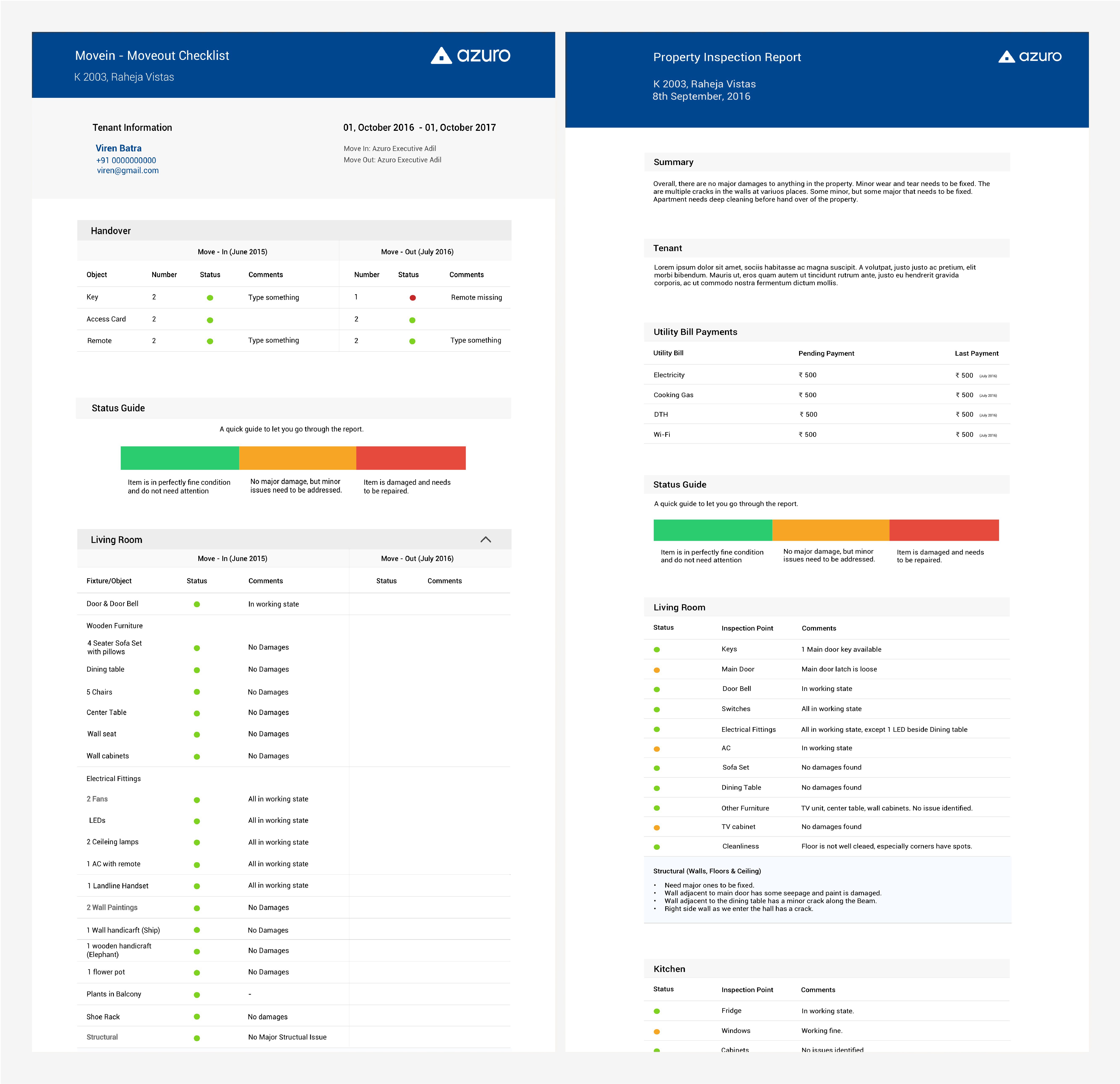

The deepest work was the in-house Tenant and Owner LMS. Each had multiple user roles with different tasks, yet everything needed a consistent look and feel across products.
I started by studying the sales teams' existing Excel sheets — that showed me how they actually worked and became the real brief. From there I mapped the stages a lead moves through — Queue, Active, Passive, Customer, Disqualified — so any user could track a lead's status and see the next step at a glance. Tenant LMS managed renters looking for homes in Mumbai; Owner LMS managed property owners and the process of converting them into customers Azuro fully services. We tested with paper prototypes and iterated closely with the team to ship fast, minimizing what each card showed while keeping clear feedback on new leads and follow-ups.


Final thoughts
Azuro reinforced that great product design starts with understanding how people already work — the Excel sheets were the real brief, and the software succeeded when it mirrored their logic instead of imposing a new one.
The redesigned website was well received in user feedback and heatmap analysis, and the LMS gave the sales teams a clearer, faster path from first call to customer.

Next projects.
(2016-25©)


